
 |
| Robinson Cano and the Yankees check in at #2. |
The design of these caps was leaked before the design was released by manufacturer New Era just a few days before Memorial Day. Leaked, as in the Mets decided to wear the caps earlier than scheduled thanks to the Bin Laden events. And so, feeling patriotic, the Mets wore these for a home game against the Giants just a while ago. They appear to be pretty much the same thing as last year's version, except that the back is now the same color as the bill. They appear to be running out of ideas, to be honest. It's important to remember that although wearing 'patriotic' caps may seem cool, they only exist for more revenue, which is exactly why they insist on making a new design every year.
Anyways, this gets us to the main subject of this post. This is the first of a three-post series in which I will count down MLB's top ten of each type of uniform (home, away, and alternate). This is supposed to start arguments, not end them. Of course, this is being written in my opinion and I want to point out that, maybe because of my age, I'm much more of a modern style of uniform liker and less traditionalist than most. This countdown only ranks the top ten out of the 30 current home uniforms. No throwbacks or retro uniforms. The top ten:
10. Cincinnati Reds
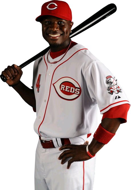 In the late 90s and early 2000s, the Reds were just another of those teams to go BFBS (black for black's sake), meaning they just added black to their color scheme spontaneously because it was a fad at the time. In fact, the BFBS revolution probably influenced more teams uniforms than any other color fad, ever. It began fading in the early to mid 2000s, but the Reds didn't unroll these (photo, left) clean, straight up home unis until 2007. I think this version rivals all other that the Reds have ever had, and considering that the Reds have been a franchise for nearly 150 years, that's an awfully long time. The black remains, but in a minor role as the highlight color.
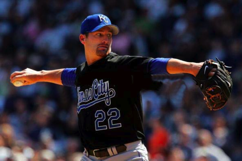
9. Kansas City Royals
 The Royals are yet another team that went crazy with black after being a royal blue and gold team for the rest of franchise history. But in 2006, they dropped all black whatsoever. All that remained was the core uniform that they've always had. The Royals as a franchise have made tremendous progress since unveiling the new uniforms, from renovating Kauffman Stadium to developing the best farm system of all time to hosting the All-Star Game next season.
8. Seattle Mariners
 This is probably not one you would expect to see on a list like this. And to be sure, this uniform has its share of flaws. For one, the script is boring. For two, this looked a whole lot better when they wore this with a teal cap, which they did from 1993 to 2003. But the Mariners home uniform makes the top ten because it's just so unique. The blue they use, which I don't even know what to call, looks great complemented by the teal that has sort of disappeared over the last decade but returned with the new teal alternates they have this season. The humble style of the uniforms are very much characteristic of the organization.
7. Chicago Cubs
 Bias aside, the Cubs pinstripes is one of the greatest uniforms around, and that's not going to change soon. It's also been improved with minor changes over the years. It's such a classic look that under the Ricketts' 'administration', the Cubs have worn it exclusively at home. The blue alternate only appears on the road because of the popularity of this uniform. Also, it's even better this year with the Ron Santo '10' patch on the right sleeve (can't be seen on this photo).
6. Cleveland Indians
 Not one you would expect to see on this list, but the Indians just have great stuff all around. Great stadium, great uniforms, great logo, great fan base, and this year, a great team. What really makes these worthy of the top 10 is the cursive script on the chest. Although the design overall isn't the most classic, it's a good mix of old school (the writing script) and modern (the blue piping down the middle).
5. Baltimore Orioles
 Does something look different about this uniform when compared to those of the rest of the league? Maybe it's that there's no red or blue, making the Orioles one of only a handful of teams that don't choose one. The Giants are the only other team to venture into black-and-orange territory, but the Orioles do it way better. For once, the black actually seems to fit the orange very well, as opposed to a lot of other teams where it seems forced.
4. Atlanta Braves
 Respect the class! This uniform has all the ingredients to pull off the retro, classic look that they're going for. Personally, I love the red bill on the cap. The contrast there is what makes the entire thing work. In fact, I wouldn't even be opposed to the Cubs wearing their red-billed cap at home. But I digress. The blue sleeves make this uniform an equal mix of blue and red. And although they aren't the most original as the Braves have changed uniforms quite a bit in their history, it sure looks original.
3. San Diego Padres
 It seems as if most Padres fans prefer the old lame brown and mustard uniforms, but I beg to ask why a change is even necessary. The current home uniforms are perfect for all that San Diego is. Not including sealife like Marlins and (Devil) Rays, the Padres are the only team in the league with a specific ocean reference. The theme in their logo is the script as a wave and it's terrific. In fact, the Padres script on the home uniform is hands down the best script in baseball. Besides that, the uniforms are simple and great. It's basically navy-on-white with a hint of sand.
2. New York Yankees
 This one is a total no-brainer. Like the Yankees, hate the Yankees, but either way the Yankee pinstripes is one of the most legendary uniforms in the history of sports. When considering this uniform, consider all that it's meant for baseball as a whole in pop culture and everyday life. This is one of those aspects about the league that makes it what it is today. As far as I know, the Yankees have never had an alternate uniform and they've never had to because this is all the franchise will ever need. It is perhaps the most famous pinstriped uniform, as well as the thickest; technically, the Yankee uniform's pinstripes are wider than those of any other teams'. Could this be symbolic of the importance of the pinstripes?
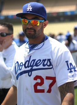
1. Los Angeles Dodgers
9. Kansas City Royals
8. Seattle Mariners
7. Chicago Cubs
6. Cleveland Indians
5. Baltimore Orioles
4. Atlanta Braves
3. San Diego Padres

2. New York Yankees
1. Los Angeles Dodgers
Thank you for reading my countdown! Do you agree or disagree with any of the rankings? Definitely shoot me an email right here. Happy summer; it could be a long one with these Cubs, so get outside or celebrate the fall of the Miami Heat!
No comments:
Post a Comment