 |
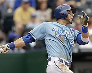
| Alex Gordon and the Royals rank #5. |
The newest addition to the three main types of baseball uniforms, the term 'alternate' was pretty much nonexistent in the baseball uniform world even just 50 years ago. Alternate uniforms, which were invented and remain today for one reason
($$$), have become a major part of MLB games. Of the 2,430 games on the MLB schedule every year, probably more than half feature at least one team wearing an alternate.
Narrowing down the top alternates proves trickier than the home and road uniforms. This is because while each team only has one home and road uniform each, making it easy to choose or eliminate, MLB teams have anywhere from zero to three alternates. The teams with zero alternates this season, the Yankees, Tigers, and Cardinals, were automatically exempt from this countdown. There's also something to be said for teams that wear their alternates
too much. If wondering why the Padres navy jersey or Rangers blue jersey isn't on here, that's why. These jerseys have been so overused, they're not exciting when the players march to the field with them on. In my count, there are a total of 48 alternate uniforms in use this season, and only the Astros and Twins have three. There were some tough decisions, but the final countdown stands as follows:
10. Houston Astros (Non-Pinstripe)
It's an alternate, but the Average Joe might give it a glance and think it's the regular home thread. No sir, these are the Saturday alternates for the 'Stros. As far as I'm concerned, however, it should be the home uniform. The
regular home threads are fine, but these stand out. The Astros were the only team in baseball for a while using this cool sedona red for a while until the Diamondbacks joined the club in 2007. Recently, the Astros have begun wearing
their road uniform with
red sleeves and caps for the first time after using black for the last decade. Making this alternate the home jersey would be the perfect complement to the red on the road. Besides, a million other teams wear black.
9. Chicago Cubs (Blue)
Most prefer the traditional pinstripes for the Cubbies, and therefore the blue hasn't been spotted at home since the beginning of the Ricketts regime (2010 season onward). But the Cubs welcomed this thread to Wrigley from 1997-2009, and I think it should be brought back on a limited basis. The jersey and t-shirt of this jersey are enormously popular in Chicago; the vast majority of Cubs t-shirts sold are of this jersey. Still, the popularity is lost somewhere in the translation and many traditionalists are glad to see the Cubs stick with the pinstripes at home. The Cubs still wear it on the road, however, in about half of road games. The walking bear in the 'C' logo is my favorite Cubs logo, and it seems right the Cubs have a jersey to proudly strut around in Cubbie blue.
8. Cleveland Indians (Navy)
Ever seen that highlight of Edgar Renteria winning the 1997 World Series for the Marlins with a walk-off single up the middle? Ever notice the jersey the Indians wore in that game? Yep, that was the same jersey, with a few minor changes. It's shown some uncommon consistency in the ever-changing alternate jersey world. And with good reason. The Tribe looks at their best in this jersey, for the script if nothing else. That iconic 'I' is one of the most stylish letters in MLB, and therefore,
that's not the only place you can find it.
7. Colorado Rockies (Purple)
In my opinion, the Rockies don't have terribly appealing uniforms in general. But that has nothing to do with this one. The Rockies, like so many other teams, use black as a featured color, meaning it dominates most of their other uniforms. The purple is what makes the Rockies unique. The Rockies are one of just six teams in the Big 4 leagues (MLB, NFL, NBA, and NHL) to have purple as a primary color (Sacramento Kings, Los Angeles Kings, Minnesota Vikings, Baltimore Ravens, Phoenix Suns, and the Rockies), and they oughta' show it. The purple jersey mysteriously disappeared between 2008 and 2010, but thankfully it has returned for 2011. Because if it's not purple for the Rockies, it's plain black. And that's pretty much a train wreck of boring.
6. Pittsburgh Pirates (Black)
The next jersey on the list is black. How ironic. But the Pirates do it right, and have, for like, ever. Fans are critical of most black alternates these days (cough, Mets), but this one has been embraced by Bucs fans. And that's because the Pirates define black and yellow. They're more black and yellow than Wiz Khalifa. Introduced in 2009, these threads are worn at home and on the road, although more frequently on the road in 2009 and 2010. After the Pirates scrapped their pinstriped alternate for this season, this one gets main stage for their alternates, and rightly so.
5. Kansas City Royals (Powder Blue)
Introduced in 2008, the Royals, along with the Blue Jays, became the first two teams since the 80s to bring back the powder blue. The Rays joined that party in 2010, but even they couldn't beat the Royals' masterpiece. It probably looks pretty similar to the home jersey. That's because it's the exact same template as that jersey, just obviously in powder blue and the name and number on both sides changes to white. The two-tone cap, added in 2010, was unnecessary, but doesn't do anything to diminish the fine looks of this jersey.
4. Los Angeles Dodgers (Brooklyn Throwback)
A one-year throwback experiment chosen by fans, the original powder blue Brooklyn Dodgers jerseys were made of satin; they shined more than a disco ball under the lights. This year's replica is made out of cotton. I believe the Dodgers are wearing this just five times this season, all weekday afternoon games. MLB's official jersey manufacturer is Majestic; they produce all the jerseys you see on the field, except for these, which are produced by Bobcat Athletic, and a few other 'special orders'. Not that it matters; it's a really cool uniform either way. Especially when the Cubs beat the Dodgers when they were wearing them, like they did on May 4.
3. Arizona Diamondbacks (Black)
The Diamondbacks' logo has to be in the top five in MLB. The iconic 'A', so iconic that it actually
survived the total color and uniform re-do that happened when the the D-Backs rolled out new uniforms prior to 2007, makes this jersey awesome. The sedona red (see: Astros) works with black terrifically in this instance. I don't understand the widespread criticism of black jerseys; when used in conjunction with a vivid highlight color, it works. No complaints about the cap or shoulder patches, either. One of the most modern uniforms in MLB right now.
2. Washington Nationals (Navy)
Many fans judge this jersey on whether or not it is truly 'patriotic'. I say chill out, since when does a baseball jersey have to be some sort of patriotic national symbol? Let's review. Why does this jersey really exist? Why of course, that same reason that all jerseys on this list exist ($$$). But it is a nice addition for the our capital's team. I like to judge it on whether or not it's a darn cool jersey, which it is. The stars and stripes in the logo are a dazzling eye attraction. The Nationals reserve this jersey for major holidays, like Memorial Day and July 4, and so it only gets game action five or six times a season. In my mind, that's a real shame.
1. Oakland Athletics (Yellow)
The A's relegated
their green alternate to road-only status in 2008 when they brought in
this eyesore of an attempt to make a black jersey. The result of that was too much black, too much yellow, and an odd struggle to find green anywhere on the jersey at all. The A's went back to the roots on this yellow beauty right here. First, the yellow looks great. Second, there's just the right amount of green and white to contrast. Third, the chest logo is perfect, and something the A's haven't featured on any uniform since 1982. And fourth, the yellow looks great. Did I mention the yellow?
How 'bout those Athletics? Even the losing record this season doesn't diminish the new alternate. In fact, only three teams got their home, road, and alternate jersey on this list: the Indians, Royals, and Dodgers. The Yankees, Athletics, Braves, Nationals, Cubs, Pirates and Diamondbacks all got two uniforms on the list, while the Orioles, Tigers, Mariners, Cardinals, Astros, Rockies, Reds, and Padres got one. The Red Sox, Rays, Blue Jays, White Sox, Twins, Rangers, Angels, Phillies, Mets, Marlins, Brewers, and Giants missed the list entirely.
This concludes my three-part countdown of MLB's Best Uniforms. I really enjoyed creating this countdown, and, judging by record viewership numbers, my readers enjoy reading them. Stay tuned for more countdowns in the future!


Quality Professional looking uniforms don't have to cost a fortune, there are so many options available today. Please visit my site and Let the experts help you outfit your Boys Baseball teams in the most vibrant color combinations, as well as incorporate sponsors' logos into the designs.
ReplyDeleteBaseball Uniforms